Tables
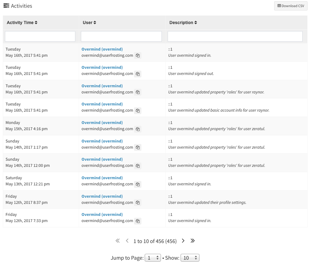
A typical application feature is to display a table of entities from a server-side data source (e.g., a database). For example, the admin Sprinkle generates client-side tables for admins to view and manage users, groups, roles, activities, and permissions:
ufTable provides a convenient way to generate sortable, searchable, paginated tables of data from an AJAX source using Mottie's tablesorter jQuery plugin.
Table skeleton
A typical use case is to create a "skeleton" <table> in your Twig template, and then use ufTable to dynamically retrieve data from a JSON data source and construct the rows. As the user sorts columns, inputs filter queries, and pages through the data, ufTable will submit new AJAX requests to the server and refresh the <table> with the results of the updated queries.
For example, consider the Users table. First, we create a partial template that extends the base tables/table-paginated.html.twig template (we can include this partial template in a page template using the include tag later):
tables/users-custom.html.twig:
{% extends "tables/table-paginated.html.twig" %}

{% block table %}
    <table id="{{table.id}}" class="tablesorter table table-bordered table-hover table-striped" data-sortlist="{{table.sortlist}}">
        <thead>
            <tr>
                <th class="sorter-metatext" data-column-name="name" data-column-template="#user-table-column-info" data-priority="1">User info <i class="fa fa-sort"></i></th>
                <th class="sorter-metanum" data-column-name="last_activity" data-column-template="#user-table-column-last-activity" data-priority="1">Last activity <i class="fa fa-sort"></i></th>
            </tr>
        </thead>
        <tbody>
        </tbody>
    </table>
{% endblock %}
Your table skeleton should be defined in the table block as a <table> element. It should have a unique id attribute, and the tablesorter class (ufTable uses this class internally to reference the table). The other classes on <table> are styling classes from Bootstrap and are optional. The data-sortlist attribute is a tablesorter setting that tells tablesorter how to initially sort the table when the page is loaded.
You'll notice that we populated the table with all of its column headers, but an empty tbody element. This empty tbody is where ufTable will automatically render the rows using data from the AJAX source.
Column headers
Each column header (th element) has several required data-* attributes that ufTable and Tablesorter use to make the table work correctly.
<th class="sorter-metanum" data-column-name="last_activity" data-column-template="#user-table-column-last-activity" data-priority="1">Last activity <i class="fa fa-sort"></i></th>Required attributes
data-column-name
This is used to determine the Sprunje filter name to use when the user types a query into the filter box for that column. For example, if we type "userfrost" into the filter box in the "User info" column:
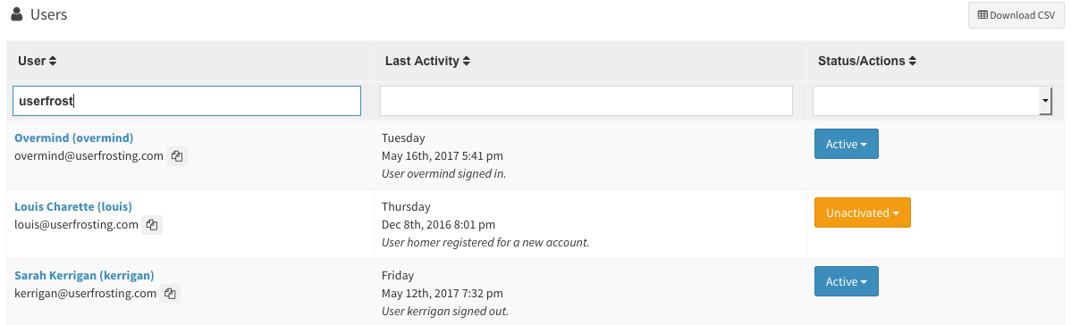
ufTable will add a query parameter filters[name]=userfrost in the next AJAX request it makes. See Data Sprunjing for information on setting up a Sprunjed data source in your server-side code.
data-column-template
An identifier used to find the Handlebars template to use when rendering the cells for that particular column. For this example, we will define two Handlebars templates in the table_cell_templates block of our Twig template:
{% block table_cell_templates %}

    {% verbatim %}
    <script id="user-table-column-info" type="text/x-handlebars-template">
        <td data-text="{{row.last_name}}">
            <strong>
                <a href="{{site.uri.public}}/users/u/{{row.user_name}}">{{row.first_name}} {{row.last_name}} ({{row.user_name}})</a>
            </strong>
            {{row.email}}
        </td>
    </script>

    <script id="user-table-column-last-activity" type="text/x-handlebars-template">
        {{#if row.last_activity }}
        <td data-num="{{dateFormat row.last_activity.occurred_at format='x'}}">
            {{dateFormat row.last_activity.occurred_at format="dddd"}}<br>{{dateFormat row.last_activity.occurred_at format="MMM Do, YYYY h:mm a"}}
            <br>
            <i>{{row.last_activity.description}}</i>
        </td>
        {{ else }}
        <td data-num="0">
            <i>Unknown</i>
        </td>
        {{/if }}
    </script>

    ...
    {% endverbatim %}

{% endblock %}
Notice that the ids in these template <script> tags match the data-column-template attributes of your table skeleton.
You'll also notice that we have custom data-* attributes in the <td> tags of each of these templates. These refer to tablesorter's custom sort parsers, which lets us define a custom parameter for tablesorter to use when sorting the table by the corresponding column. We will discuss this more later.
As an alternative to the data-column-template attribute, you may map column names to template identifiers, or even callback functions, in ufTable's initialization using the columnTemplates option. For example:
$('#widget-users').ufTable({
    dataUrl: site.uri.public + '/api/users',
    columnTemplates: {
        name: function (params) {
            return "<td>" + params.row.full_name + "</td>";
        },
        last_activity: '#user-table-column-last-activity'
    }
});
These will override any template identifiers specified in the table headers' data-column-template attributes. If you map a column name to a string, it will work the same way as data-column-template, using it as a selector to find a corresponding <script> element that contains a Handlebars template. However if you map a column name to a callback, the callback will be used directly to render the corresponding cells for that column. An object containing the row object, the rownum row number, and the site object will be passed into the callback during table rendering.
data-priority
This attribute is used by Tablesorter's column selector widget to determine which columns can be hidden in tablet and mobile views to make the table more usable.
| Priority | Hide when browser width is less than... | Comment |
|---|---|---|
| "critical" | Never | Highest priority - never hide this column |
| 1 | 320px | |
| 2 | 480px | |
| 3 | 640px | |
| 4 | 800px | |
| 5 | 960px | |
| 6 | 1120px | Lowest priority |
Note that while normally you can hide/show columns by using the selectors generated in the table tool menu, you cannot hide any columns with a priority of critical.
Optional attributes/classes
You can further control the behavior of a column with the following attributes/classes:
data-sorter
Set to false to disable sorting for this column.
data-filter
Set to false to disable filtering for this column.
data-placeholder
Use this to set placeholder text for the column filter input (search field).
class="filter-select"
When you add this CSS class to your table, Tablesorter will generate a dropdown instead of a free text input for searching this column. Values for this dropdown will be populated from the corresponding listable array returned by your table's Sprunje.
Table wrapper
To use your table, simply include your table partial template in your page inside a wrapper <div>:
<div id="myUserTable" class="box box-primary">
    <div class="box-header">
        <h3 class="box-title pull-left"><i class="fa fa-fw fa-user"></i> Members</h3>
        {% include "tables/table-tool-menu.html.twig" %}
    </div>
    <div class="box-body">
        {% include "tables/users-custom.html.twig" with {
                "table" : {
                    "id" : "table-members"
                }
            }
        %}
    </div>
    <div class="box-footer">
        <button type="button" class="btn btn-success js-member-create">
            <i class="fa fa-plus-square"></i>  Create member
        </button>
    </div>
</div>
This example shows an AdminLTE "box" component being used to display our table, but you don't have to use the box component to use ufTable. The important thing is that we've wrapped our table and all related controls (table tool menu, buttons, etc) inside a single wrapper element (the myUserTable div).
In your page Javascript, initialize ufTable on your wrapper element:
$("#myUserTable").ufTable({
    dataUrl: site.uri.public + "/api/owls"
});
Where the only parameter is a JSON object containing the configuration options for your table. Most importantly, be sure to specify the dataUrl option so that ufTable knows where to get the table data from!
Additional table controls
All of these controls come pre-implemented in UserFrosting, but you are welcome to override and customize them in your own table templates if necessary.
Download button
Any button with the .js-uf-table-download class inside your wrapper is bound to trigger an AJAX request for downloading the table in CSV format.
This is implemented by default in the table tool menu, in tables/table-tool-menu.html.twig.
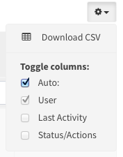
Column selectors
ufTable will generate a list of checkboxes for manually hiding/showing table columns in any container element with the js-uf-table-cs-options class. This is implemented by default in the table tool menu, in tables/table-tool-menu.html.twig.
Global search
In mobile views, ufTable will hide the per-column filters and display a global search field instead. This field should be inside a container with the js-uf-table-search class.
When a global search is performed, ufTable will send the search query to your data API for a field with the name _all. By default, Sprunjes implement a filterAll method which searches all filterable fields, but of course you may override this method in your own Sprunje.
This global search field is implemented by default for you in tables/table-paginated.html.twig.
Table info
When ufTable can't find any rows for the table (subject to the filter constraints), it will display a "No results" message in a container with the js-uf-table-info class. This container is implemented by default for you in tables/table-paginated.html.twig.
Pager controls
The table page controls (next page, previous page, jump to page, etc) are implemented inside a container with the js-uf-table-pager class. This container is implemented by default for you in tables/table-paginated.html.twig.
Options
The following options can be used when you initialize ufTable on the wrapper element.
$("#myUserTable").ufTable({
    ...
});
dataUrl
The absolute url for the table's AJAX data source. ufTable expects the data source to use the Sprunje API. Thus, it should be able to understand the API for Sprunje requests, and return data in the Sprunje response format:
{
    "count": 2,
    "count_filtered": 2,
    "rows": [
        {
            "id": 11,
            "species": "Bubo scandiacus",
            "description": "Snowy owls are native to Arctic regions in North America and Eurasia. Males are almost all white, while females have more flecks of black plumage. Juvenile snowy owls have black feathers until they turn white. The snowy owl is a ground nester that predominantly hunts rodents."
        },
        {
            "id": 8,
            "species": "Megascops asio",
            "description": "This species is native to most wooded environments of its distribution and, more so than any other owl in its range, has adapted well to manmade development, although it frequently avoids detection due to its strictly nocturnal habits."
        }
    ]
}
msgTarget
If ufTable receives an error from the server when it attempts to retrieve row data, it will automatically retrieve any error messages from the alert stream and render them on the page. msgTarget allows you to specify an element of the DOM where ufTable should display these messages.
Internally, ufTable will set up a ufAlerts widget to fetch and render the alert stream messages.
If msgTarget is not specified, ufTable will look for an element on the page with an id of #alerts-page by default.
tablesorter
An object containing tablesorter's configuration options. The default values for this object are:
{
    debug: false,
    theme     : 'bootstrap',
    widthFixed: true,
    // See https://mottie.github.io/tablesorter/docs/example-pager-ajax.html
    widgets: ['saveSort', 'sort2Hash', 'filter', 'pager', 'columnSelector', 'reflow2'],
    widgetOptions : {
        columnSelector_layout : '<label><input type="checkbox"> <span>{name}</span></label>',
        filter_cssFilter: 'form-control',
        filter_saveFilters : true,
        filter_serversideFiltering : true,
        filter_selectSource : {
            '.filter-select' : function() { return null; }
        },

        // apply disabled classname to the pager arrows when the rows at either extreme is visible
        pager_updateArrows: true,

        // starting page of the pager (zero based index)
        pager_startPage: 0,

        // Number of visible rows
        pager_size: 10,

        // Save pager page & size if the storage script is loaded (requires $.tablesorter.storage in jquery.tablesorter.widgets.js)
        pager_savePages: true,

        // if true, the table will remain the same height no matter how many records are displayed. The space is made up by an empty
        // table row set to a height to compensate; default is false
        pager_fixedHeight: false,

        // remove rows from the table to speed up the sort of large tables.
        // setting this to false, only hides the non-visible rows; needed if you plan to add/remove rows with the pager enabled.
        pager_removeRows: false, // removing rows in larger tables speeds up the sort

        // target the pager markup - see the HTML block below
        pager_css: {
            errorRow    : 'uf-table-error-row', // error information row
            disabled    : 'disabled' // Note there is no period "." in front of this class name
        },

        // Must be initialized with a 'data' key
        pager_ajaxObject: {
            data: {},
            dataType: 'json'
        },
        // jQuery selectors
        pager_selectors: {
          container   : '.pager',       // target the pager markup (wrapper)
          first       : '.first',       // go to first page arrow
          prev        : '.prev',        // previous page arrow
          next        : '.next',        // next page arrow
          last        : '.last',        // go to last page arrow
          gotoPage    : '.gotoPage',    // go to page selector - select dropdown that sets the current page
          pageDisplay : '.pagedisplay', // location of where the "output" is displayed
          pageSize    : '.pagesize'     // page size selector - select dropdown that sets the "size" option
        },

        // hash prefix
        sort2Hash_hash              : '#',
        // don't '#' or '=' here
        sort2Hash_separator         : '|',
        // this option > table ID > table index on page
        sort2Hash_tableId           : null,
        // if true, show header cell text instead of a zero-based column index
        sort2Hash_headerTextAttr    : 'data-column-name',
        // direction text shown in the URL e.g. [ 'asc', 'desc' ]
        sort2Hash_directionText     : [ 'asc', 'desc' ], // default values
        // if true, override saveSort widget sort, if used & stored sort is available
        sort2Hash_overrideSaveSort  : true, // default = false
    }
}
addParams
An object containing any additional key-value pairs that you want appended to the AJAX requests made by the table. Useful when implementing, for example, site-wide filters or using data sources that require additional context.
When sending an AJAX request to a Sprunje, there are some hoops to jump through:
- Remember that sprunjes only accept certain parameters. If, for instance, you want to filter by "UserID" that's set outside of the table, you'll need to pass
filters[UserID]in the AJAX request rather than simplyUserID. - Additionally, sprunjes only accept whitelisted fields, so you'll need to ensure that
UserIDis in the appropriate array in the sprunje--in this case,$filterable. - Optional: Unless you're hardcoding the parameter value, you may need to export it to JS.
In this Javascript sample, we've already asked the user for a Genus name and exported it to the variable page.owl.genus.
$("#myUserTable").ufTable({
    dataUrl: site.uri.public + "/api/owls",
    addParams: {"filters[species]" : page.owl.genus}
});
filterAllField
The special filter name that should be sent in AJAX requests when a global search (as opposed to column-specific searches) is performed. Defaults to _all.
useLoadingTransition
Specify whether to display a loading transition overlay on the table while waiting for rows to be retrieved and rendered. Defaults to true.
columnTemplates
Specify the templates used to render the cells of each column, by mapping each column name to either a reference to a <script> tag that contains a Handlebars template, or a or callback function. Defaults to using the references in the data-column-template attributes of each table column header. See the column headers section for more information on how this works.
columnTemplates or in your table headers' data-column-template attributes.rowTemplate
Specify a custom template for rendering the opening <tr> tag of each row. If set to null (default), ufTable will simply render a plain <tr> tag. If passed a string, it will attempt to resolve a reference to a <script> tag containing a Handlebars template. If passed a callback, it will simply use that callback to render your <tr> tag.
For example:
$('#widget-users').ufTable({
    dataUrl: site.uri.public + '/api/users',
    rowTemplate: function (params) {
        if ((params.rownum % 2) == 0) {
            return "<tr style='color: red'>";
        }
        return "<tr>";
    }
});
Or alternatively, using a Handlebars template:
$('#widget-users').ufTable({
    dataUrl: site.uri.public + '/api/users',
    rowTemplate: '#user-table-row'
});
with a corresponding template:
<script id="user-table-row" type="text/x-handlebars-template">
    {{#ifx (calc rownum '%' 2) '==' 0}}
        <tr style="background-color: red">
    {{ else }}
        <tr>
    {{/ifx}}
</script>
download.button
A jQuery selector that corresponds to the "download table" button. Defaults to any matching $('.js-uf-table-download') elements in the table container.
download.callback
Specify a custom callback function to perform the table download.
info.container
A jQuery selector that corresponds to the table info container. Defaults to any matching $('.js-uf-table-info') elements in the table container.
info.callback
Specify a custom callback function to render table info messages.
info.messageEmptyRows
Specify the message to be displayed in the info container when no matching records were found. Defaults to the data-message-empty-rows atttribute of the info container. If data-message-empty-rows is not specified, defaults to "Sorry, we've got nothing here."
overlay.container
A jQuery selector that corresponds to the table overlay container, which will be displayed while the table is retrieving and rendering rows. Defaults to any matching $('.js-uf-table-overlay') elements in the table container.
Events
ufTable triggers the following events:
pagerComplete.ufTable
Triggered when the tablesorter pager plugin has completed rendering of the table.
Of course, you can always bind handlers directly to tablesorter's events as well.
Methods
getTableStateVars(table)
Fetches the current page size, page number, sort order, sort field, and column filters.
getSavedFilters(table)
Get saved filters from the browser's local storage.
refresh
Refreshes the table by re-querying the data URL with the current set of filters, sorts, etc. Usage: $("#myUserTable").ufTable("refresh");
Customizing the base template for your table
If you don't want to use the default table-paginated.html.twig base template for your tables, you can create your own base template. Your template needs to have six things:
{% block table_search %}: Global search field for the table. By default, only shown in mobile sizes. To customize this behavior, see the media queries incore/assets/userfrosting/css/userfrosting.css.{% block table %}: This is the Twig block where the table skeleton will go.{% block table_cell_templates %}: This is the Twig block where cell templates will be placed.{% block table_info %}: This is a container for displaying alternative messages, such as "no records found". The container element should have thejs-uf-table-infoclass.{% block table_pager_controls %}: A container for navigation controls for your table's pagination. The container element should have thejs-uf-table-pagerclass.{% block table_overlay %}: A container that implements the 'loading' overlay for tables. The overlay element should have thejs-uf-table-overlayclass.
Your base template might end up looking something like:
{% block table_search %}
<div class="form-group has-feedback uf-table-search js-uf-table-search">
<input type="search" class="form-control" data-column="all">
<i class="fa fa-search form-control-icon" aria-hidden="true"></i>
</div>
{% endblock %}
<div class="table overlay-wrapper">
{% block table %}
{# Define your table skeleton in this block in your child template #}
{% endblock %}
{% block table_cell_templates %}
{# Define your Handlebars cell templates in this block in your child template #}
{% endblock %}
{% block table_info %}
<div class="uf-table-info js-uf-table-info" data-message-empty-rows="{{translate('NO_RESULTS')}}">
</div>
{% endblock %}
{% block table_pager_controls %}
<div class="pager pager-lg tablesorter-pager js-uf-table-pager" data-output-template="{{translate('PAGINATION.OUTPUT')}}">
<span class="pager-control first" title="{{translate("PAGINATION.FIRST")}}"><i class="fa fa-angle-double-left"></i></span>
<span class="pager-control prev" title="{{translate("PAGINATION.PREVIOUS")}}"><i class="fa fa-angle-left"></i></span>
<span class="pagedisplay"></span> {# this can be any element, including an input #}
<span class="pager-control next" title="{{translate("PAGINATION.NEXT")}}"><i class="fa fa-angle-right"></i></span>
<span class="pager-control last" title= "{{translate("PAGINATION.LAST")}}"><i class="fa fa-angle-double-right"></i></span>
<br><br>
{{translate("PAGINATION.GOTO")}}: <select class="gotoPage"></select> • {{translate("PAGINATION.SHOW")}}:
<select class="pagesize">
{% for count in pager.take|default([5, 10, 50, 100]) %}
<option value="{{count}}">{{count}}</option>
{% endfor %}
</select>
</div>
{% endblock %}
{% block table_overlay %}
{% if site.uf_table.use_loading_transition %}
<div class="overlay js-uf-table-overlay hidden">
<i class="fa fa-refresh fa-spin"></i>
</div>
{% endif %}
{% endblock %}
</div>